When making a room look breathtaking, many people turn to traditional colour palettes and interior options but don’t be afraid to take risks. If you are looking for an eye-catching design to make your home stand out, why not try embracing bold jewel tones? By innovatively introducing these dazzling hues into your living space, you can create a powerful statement in any room that will surely blow away visitors! This blog post will explore how jewel tones can be used successfully when decorating your home.
What are jewel tones?
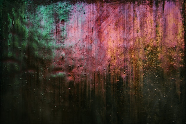
Jewel tones are a term used to describe a vibrant range of colours typically found in precious gems, semiprecious stones, and metals. These full-bodied shades often appear as warm blues, cool greens, smoky violets, magentas and pinks, deep teals, purples, lush oranges and plums. Jewel tones inspire those looking to create an eye-catching and unique decor style – working together or standing on their own against crisp white or neutral walls.
For example, pairing bright emeralds with soft lavenders can help create a retro-inspired look or layering heavily saturated sapphires can bring a much-needed luxury to any sophisticated gathering space. No matter how you plan to incorporate jewel tones into your home decor this season, you will surely add colour and sparkle all at once!
Choosing the right jewel tones for your space
Understanding the Color Wheel
The first step in incorporating jewel tones into your decor is understanding which colours work together. A great place to start is with an understanding of the colour wheel. A colour wheel is an easy-to-use tool that shows how different colours interact. Knowing how warm and cool colours work together will help create a stunning palette for your space.
When using jewel tones in your decor, look for colours that have similar values on the colour wheel. For example, if you choose between deep purple and royal blue, consider their placement on the wheel: royal blue is directly next to purple on the wheel. They will likely look great when used together in your room design!
Making Colours Work Together
Once you have chosen a few complementary jewel tones for your space, it’s time to think about how they will work together in the overall design of your room. One way to make them blend nicely is by using different shades of each colour—for example, if you use deep purple as one of your primary colours, try adding lighter shades of lavender or mauve as accents throughout the room. This will help keep everything from looking too “matchy-matchy” while providing a unified look throughout the space.
Another option is to add neutral colours, such as whites or greys into the mix—these will help balance out any bold jewel-tone elements without making them seem overwhelming or out of place. Finally, do not be afraid to mix prints! Patterns such as stripes, polka dots, and chevrons can provide texture and visual interest without clashing with other design elements in the room.
Incorporating jewel tone accents
Incorporating jewel-tone accents into your home decor and wardrobe can be an easy and stylish way to make a statement. Rich, saturated colours such as emeralds, rubies and sapphires have classic appeal and look modern when used unexpectedly. Add drama by adding bold curtains, accent pillows or rugs to a room, or bright-coloured clothing items like coats, handbags or boots to perk up an everyday outfit.
Jewel tones can also be a great way to enhance natural wood furniture – a bright throw blanket or patterned fabric upholstery can provide the perfect pop of colour without overwhelming the space. It will bring life and character to any look regardless of how you incorporate jewel tone accents into your style.
Using jewel tones to lighten or darken a room
Jewel tones are one of the most effective ways to instantly transform a room without completely redecorating. Using jewel tones to lighten or darken a room is as simple as adding and taking away colour. To brighten a room, you can add pops of colour with bold jewel tones like royal blue or emerald green. You do not have to commit to such big changes immediately; simply painting one wall in the desired shade is enough for an impactful statement.
Alternatively, layering similar shades together will achieve the desired effect to make a room feel cosier. Utilize earthy colours such as burnt orange and deep magenta – these hues create an incredibly soothing and tranquil atmosphere that will keep you relaxed all day!
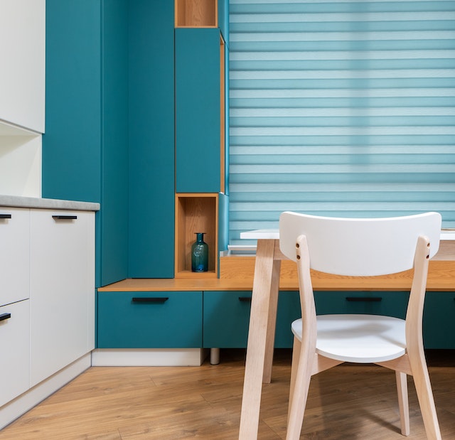
Making a statement with jewel-tone furniture
Jewel-tone furniture can make a bold and beautiful statement in any room. A pop of vibrant sapphire, emerald or ruby instantly adds life to a drab space, while pieces such as velvet sofas, leather armchairs and eclectic side tables create an inviting atmosphere. Since jewel tones already draw attention, why not take advantage of them?
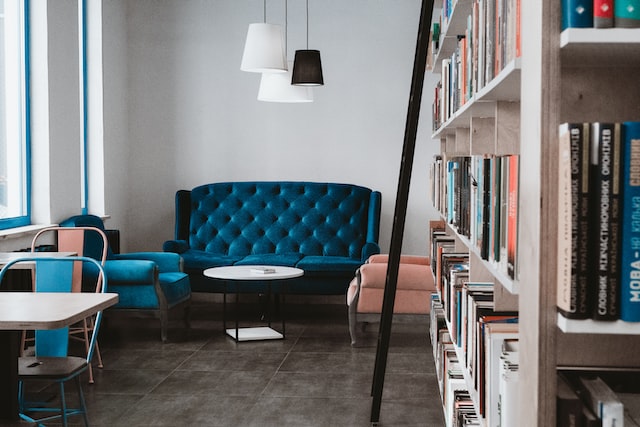
Choose multiple pieces in complementary hues that stand out yet harmonize together; this is especially effective when introducing them into traditional living rooms since they will contrast against more muted shades like blues and greys. Lastly, layer different textures and materials — think glass, metal, ceramic and wood — to pull the look together. With the right combination of accessories, your jewel-tone furniture can exude creative elegance that will not fade anytime soon!
How to choose complementary colours
Jewel tones such as emeralds, sapphires, and rubies are strikingly bold to work with when it comes to colour schemes. Remember that contrast can be your best friend when choosing complementary colours for these vibrant hues. Create contrast by pairing a jewel tone with a neutral palette, like dusty pinks and greys, with a deep cobalt blue or ivory and blush for warm amethyst purple. The neutrals will ground the look while still allowing the vibrancy of the jewel tone to pop.
If you want something more daring and playful, try experimenting with analogous hues, such as royal purples and blues set against acid greens and yellows. Ultimately, when deciding on complementary colours representing your favourite jewel tones, do not forget to have fun with it and allow yourself to get creative!
Creating a feature wall using jewel tones
Creating a feature wall using jewel tones is an easy and affordable way to harmonize a room and create an inviting atmosphere. A wall featuring jewel tones creates contrast without feeling overwhelming, playing on their subtlety while adding visual interest.
Start by shopping around for wallpaper and paint swatches in shades such as sapphire blues, ruby reds, emerald greens and more. Choose your colour palette carefully – selecting too many will overpower the wall space, so stick to one or two key hues that you can accentuate with complementary shades. Think of the associated textures: soft velvet giving off a glossy sheen, metallic wallpapers bouncing light across the space or richly-coloured marbles adding opulence. Add your chosen pieces slowly – a picture frame here and there or accessories on shelves – play mix-and-match until you find a balance that satisfies you.
Finally, enjoy the finishing touches: an eye-catching chandelier catching light in the evening hours or floral arrangements bringing nature indoors; these flourish as statement pieces against your newly created feature wall.
Balancing jewel tones with neutral shades
Adding colourful jewel tones to an outfit or space is a great way to draw attention and create an eye-catching look, especially in a grey home interior. But you do not want your colours to be too overpowering, which is why it is essential to know how to balance jewel tones with neutral shades. Start by pairing a bold hue with softer colours like tan or dove grey to achieve a harmonious balance between bold jewel tones and the neutral hues of a grey interior design.
If the colours are too comparable in brightness, the overall look can be muddled and confusing instead of chic and intentional. Include lighter tints of your colours throughout, such as with statement accessories or patterned artwork. This can help bright ground hues while maintaining a cohesive style. Finally, do not forget about texture; adding different materials like velvet, suede, and wool can make all the difference in finishing off a polished look!
Conclusion
The holidays are a great time to show off your home’s style. If you want to really wow your guests, go for jewel tones. Rich and luxurious, these colours make any space feel inviting and glamorous. Use them sparingly for maximum impact – think accents like pillows, throws, and table runners. With just a few key pieces, you can transform your home into a holiday haven that will have everyone talking long after the party is over.